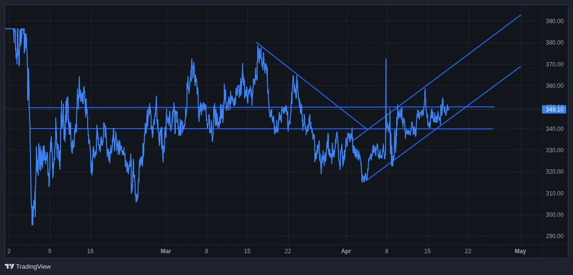
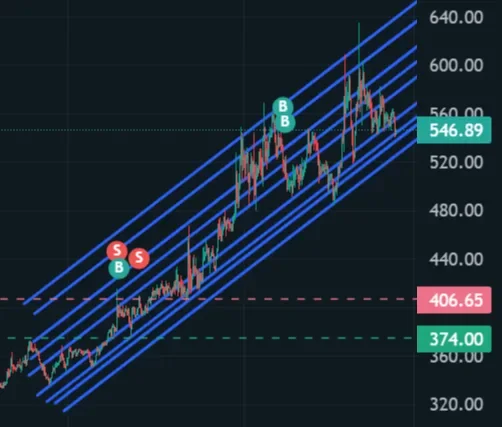
@esna7 For the support and resistance lines they are too squeezed together. It makes the chart harder to read.
I’d start by identifying the more obvious swing highs and swing lows rather than trying to mark every small reaction. Then use those areas to establish your main horizontal levels.
Also, I wouldn’t treat support and resistance as exact prices. Price often reacts within a range, so a zone can make more sense than a thin line. For example, if price repeatedly reacts around $340–$350, that can be one resistance zone rather than several separate lines at $342, $345, $347, etc.
For the rising channel, use the more significant lows to establish the lower trendline, then a parallel line through the corresponding highs. You don't need the lines to touch every wick.
Basically:
- Major swing highs → resistance
- Major swing lows → support
- Repeated reactions around the same area → consider it a zone
- Rising sequence of lows → lower channel line
- Parallel line through the major highs → upper channel line
Then zoom out and see whether the structure still makes sense. If there are so many lines that it's difficult to see the actual price structure, you've probably marked too many levels.
For a first analysis, though, you're looking in the right direction. The important thing is learning to distinguish the larger structure from the smaller ones.
- @yayogerardo, writer, researcher, analyst, anarchist, autonomist, Humanoid 🃏™️